OVERVIEW
Manual AP work hides in plain sight. A vendor mapping that breaks once a week, a GL code that gets edited on every fifth invoice, a location that consistently runs slower than the others. None of it shows up on the invoice itself, and most teams only feel it as a vague sense of being busy.
The Operational Efficiency Dashboard surfaces every edit, mapping fix, and processing delay already captured in your Ottimate invoices, organizes them by staff, location, vendor, and process, and shows you where the manual work is concentrated. You can use it to spot which vendors are creating the most rework, which locations are pulling team productivity down, and which mapping gaps are worth fixing first.
Key questions this dashboard answers:
Where is my team's manual work going, and is it getting better or worse?
Which locations are running efficiently and which need coaching?
Which vendors are driving the most rework, and how do I fix it?
Where are mapping and approval bottlenecks slowing my AP team down?
HOW IT WORKS
The dashboard reads every invoice processed in your Ottimate account over the selected date range and classifies the manual work on each one. An invoice is "touchless" when it flowed through Ottimate with no edits to its header, line items, GL codes, vendor, or PO. Anything edited counts as manual work, and each edit is categorized by what was changed (GL code mapping, vendor mapping, PO number, invoice fields, duplicate check).
All time-savings estimates use blended industry averages (around 4 minutes per edit, with some edit types costing more time than others). You'll see these displayed as approximate values (~4.3 hrs/week), and your team's actual minutes per edit may vary.
The metrics used across the dashboard:
Edit Rate: share of invoices that required at least one manual edit. Excellent below 8%, good 8-12%, average 12-15%, needs attention above 15%, critical above 20%.
Avg Processing: average calendar days between when an invoice is received and when it's fully processed.
Invoices Processed: total invoice volume in the selected date range and locations.
Exception Rate: share of invoices that hit a processing exception and required manual resolution.
Location Score and Vendor Score: composite 0-100 scores that blend touchless rates, edit rates, mapping accuracy, and processing time. Green above 90, blue 80-89, amber 70-79, red below 70.
All dashboard metrics are calculated against the invoice activity in the selected date range, and the date filter controls when each invoice was received and processed by Ottimate.
Data is refreshed daily. The page header shows a Last updated timestamp so you can confirm how current the view is.
Note: Edit rates reflect invoices that required manual changes, often because Ottimate's vendor mapping, GL mapping, or capture didn't have the right context yet. A high edit rate for a specific vendor or location is a signal to fix the underlying mapping or capture configuration. It isn't a measure of individual staff performance.
WHERE CAN I FIND THE OPERATIONAL EFFICIENCY DASHBOARD?
From the left navigation, go to Reports → Dashboards, then click the row labeled Operational Efficiency.

If you don't see the row, ask your Ottimate administrator to confirm your role has both the View Admin Reports and View Analytics Dashboards permissions enabled.
HOW DO I USE THE DASHBOARD?
Open Reports → Dashboards and click the Operational Efficiency row.
Set the date range and select the locations you want to review. The filters apply to every tab and persist as you navigate.
Start on Overview to see where manual time is going and how your touchless and edit rates are trending.
Click into Staff Performance, Locations, or Vendors to find the people, places, and vendors driving the most work.
Use Processes when you want to dig into specific patterns: which fields are being edited most, which mappings are slipping, and where approvals are stalling.
On most tables, click a row to expand and drill into the underlying invoices.
HOW DO I USE THE DATE FILTER TO FILTER FOR A SPECIFIC INVOICE DATE RANGE?
In the filter bar at the top of the dashboard, click the date range control.
Pick a preset (Last 7 days, Last 30 days, Last 90 days) or choose Custom to set a specific From / To range. The end date can't go past today.
Every chart, KPI, and table on the dashboard updates automatically. The range stays applied as you switch tabs.

WHAT ARE THE ELEMENTS OF THE DASHBOARD?
The dashboard has five tabs, each answering a different question.
1. Overview: Where is my team's manual work going?
A single-page summary of touchless rate, edit rate, processing time, and where the manual minutes are concentrated.
Where does time go? A panel that estimates total manual hours per week and breaks them down by edit type (GL code mapping, vendor mapping, PO resolution, invoice edits). Click any edit type to open a drill-down of the specific invoices.
KPI cards. Touchless Rate, Edit Rate, Avg Processing, Invoices Processed, and Exception Rate, each with a color-coded threshold badge and a week-over-week change. Click a card to see a PO vs Non-PO breakdown for that metric.
Daily Invoice Volume and Daily Edit Rate trend charts. The granularity switches automatically (daily for short ranges, weekly for longer ones).
Edit Breakdown chart. Shows how the edits decompose by category and what each category is costing in time.

2. Staff Performance: Who needs context, coaching, or a better Ottimate configuration?
A view of how each AP team member is working in Ottimate. Use it to spot who is processing the most invoices, who is running into the most edits, and which patterns repeat week over week. A persistent blue banner at the top of the tab reminds you that edit rates reflect Ottimate configuration gaps, not individual staff performance. The Edit Rate trend chart is labeled "Ottimate Gaps" for the same reason.
Summary cards: total team members, team average daily invoices (with week-over-week change), top performer, and total team manual work.
Team trend charts: two side-by-side weekly charts: Average Daily Invoices per Person and Edit Rate % (Ottimate Gaps) by week.
Staff Performance table: sortable, searchable table with daily average, % vs team, edit rate, week-over-week change, location, and a performance category badge (Exceptional, Above Average, Average, Below Average, or Needs Attention). Sorted by largest negative variance vs team by default, so the rows that need attention surface first. Expand a row for weekly invoice volume, the edit-rate trend, and a week-by-week breakdown.
Approvals view: the same table structure scoped to approval activity instead of edits, so you can see who is approving what and how quickly.
Invoice history drill-down: click the document icon on any row to open a full invoice history for that team member, including totals, edit-type breakdown, and a filterable invoice list.

3. Locations: Which locations are performing, and which need support?
A side-by-side view of how each of your locations is processing invoices. Useful for multi-property and multi-unit operators comparing performance across sites.
Summary cards: number of locations, average location score, best performer, and total invoice volume.
Location score bar chart: a horizontal ranking of every location by score, color-coded by performance band.
Location table: sortable columns for score, invoices, touchless mapping rate, touchless capture rate, edit rate, average processing days, and staff count. Expand any row to see a process-efficiency timeline (uploaded → processed → approved → exported) and drill into the location's invoices.

4. Vendors: Which vendors are creating the most manual work?
Most rework is concentrated in a small number of vendors. This tab finds them and quantifies the time impact.
Summary cards: active vendors, average vendor score, problematic vendors (score below 70), and time-savings potential if every vendor matched your best performer.
Alert banner: appears when one or more vendors score below 70, naming the vendors and the aggregate time impact.
Vendor score bar chart: ranks every vendor by score, sorted worst-first so the biggest issues surface immediately.
Vendor Performance table: sortable columns for score, invoices, total spend, PO and non-PO match rates, edit rate, GL mapping rate, average processing days, and Time Savings (hrs/week recoverable if this vendor's edit rate matched the best performer). Sort by Time Savings to rank vendors by the impact of fixing them.
Vendor Quality view: splits each vendor's documents into valid invoices, duplicates, and non-invoices so you can see which vendors are sending noise alongside their invoices.
Vendor Process Efficiency view: shows upload, approval, and payment days per vendor, so you can see which vendors are slow at each step of the cycle.


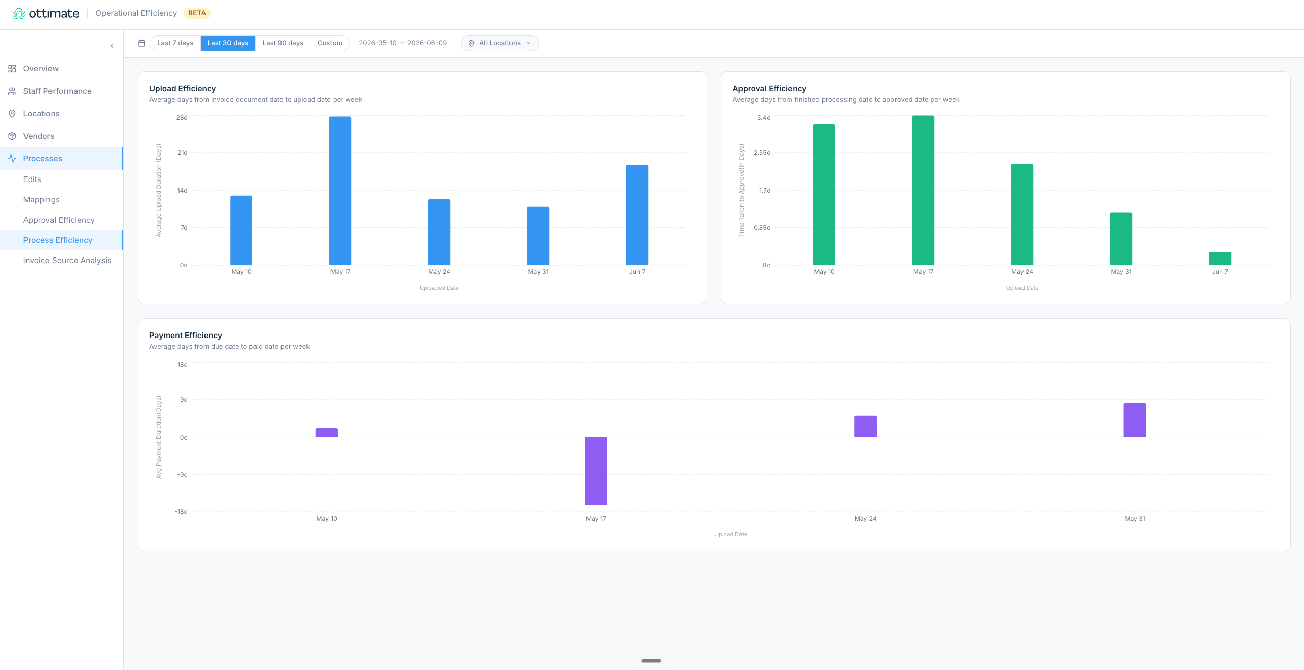
5. Processes: Where are the bottlenecks in how invoices flow through Ottimate?
The deepest analytical tab. Four sub-views, each focused on a specific part of the AP workflow.
Edits: which invoice and line item fields are getting edited most often, the edit rate trend over time, and which vendors drive the most header-level and line-level edits.
Mappings: how often Ottimate's GL and vendor mappings are auto-applied vs needing manual fixes, broken down by vendor.
Approval Efficiency: weekly approval-duration trend, plus tables showing the history of approved invoices and invoices currently waiting for approval.
Process Efficiency: weekly upload-duration and approval-duration trends, so you can pinpoint where the AP cycle is slowing down.

FILTERS AVAILABLE ON THE DASHBOARD
All filters apply to every tab and persist as you move between them.
Date range: presets (Last 7 days, Last 30 days, Last 90 days) or a custom From / To range. Defaults to Last 30 days. The end date can't be set past today.
Locations: multi-select, searchable. Only the locations you have access to in Ottimate are shown. Leaving the selection empty includes all of your accessible locations.
ACCESS & PRICING
Available to users whose role has both the View Admin Reports and View Analytics Dashboards permissions enabled. Users without one or both of these permissions won't see the dashboard row under Reports → Dashboards.
If you or someone on your team is unable to find the dashboard, they're likely missing one of these permissions. Ask the user with Administrator role permissions to activate View Admin Reports and View Analytics Dashboards for the user with missing access.
Pricing and availability are handled as part of your Ottimate plan. Reach out to your Customer Success Manager for specifics.
FAQS
Q. Why is my edit rate so high for a specific vendor or staff member?
A. A high edit rate usually means Ottimate's mappings, capture, or PO matching for that vendor or location aren't set up correctly yet. Click into the row to see which fields are getting edited most often. Once you fix the underlying mapping or capture rule, the edit rate will start dropping on the next invoices that come through.
Q. Are the "manual hours per week" numbers exact?
A. They're estimates, which is why they're shown with a tilde (~4.3 hrs/week). Each edit type uses an industry-average time-per-edit (around 4 minutes for GL coding and PO resolution, 3 minutes for vendor mapping and invoice edits, 2 minutes for duplicate checks). Your team's actual minutes per edit may vary, but the relative comparisons across staff, locations, and vendors are accurate.
Q. How far back does the data go?
A. The date filter currently supports up to 90 days as a preset, or a custom range you define. Data is calculated against the invoices in your selected range.
Q. Does the dashboard show all my locations?
A. Yes, by default. You'll see every location your role has access to. Use the Locations filter to narrow the view to a specific site or group of sites for comparison.
Q. Does the staff view track individual performance?
A. It tracks how invoices flow through Ottimate for each team member, not how hard they're working. A higher edit rate for a staff member typically reflects the vendors and locations they handle, or gaps in Ottimate's mapping configuration. Use this tab to spot patterns and fix the underlying setup, not to grade your team.
Q. Can I drill down into the specific invoices behind a metric?
A. Yes. Most charts and tables let you click in to see the underlying invoices. On Overview, click an edit type in the "Where does time go?" panel. On Staff, Locations, and Vendors, click the document icon on any row to open the invoice history for that team member, location, or vendor.
Q. Why doesn't my edit count for a staff member match what I see in their AP queue?
A. Edits are attributed to the user who performed the edit, not the user who uploaded the invoice. The staff row reflects what each user did to the invoice in Ottimate, not what they uploaded. The two won't always be the same person.
Q. How do I compare my numbers to other companies or industry benchmarks?
A. Trend charts include reference lines for the Ottimate platform median and top performer, so you can see how you're tracking against the broader Ottimate user base. External industry benchmarks aren't shown by design: peer comparisons across very different AP setups are often misleading, and internal benchmarking ("our Austin location does it, so our LA location can too") is usually the more useful framing.
Q. Does the dashboard work on mobile?
A. The dashboard is designed for desktop and laptop screens. A phone or tablet will technically load it, but the layout, tables, and drill-down modals are best on a larger screen.
Q. Why don't I see any data?
A. The most common reasons are: your account is new and hasn't processed enough invoices in the selected range, your filters are too restrictive (try a wider date range or clear the Locations filter), or your role doesn't have access to invoices from any of the locations being filtered. If none of those apply, reach out to support.
Q. Can I export this data or schedule a report?
A. Invoice-level CSV export is available from the drill-down views (the staff, location, and vendor invoice history modals). Formatted PDF/HTML reports and scheduled email digests are on the roadmap.
Q. How is this different from the other dashboards in Ottimate?
A. Other Ottimate dashboards focus on spend (Cost Analysis, Cost Overages, Surcharge Tracker). The Operational Efficiency Dashboard focuses on the process behind that spend: how invoices flow through your team, where the manual work concentrates, and which vendors, locations, or mappings are slowing you down. Most operators benefit from using both: spend dashboards for what you're paying, Operational Efficiency for how efficiently you're paying it.
For further assistance, contact Ottimate Support by emailing support@ottimate.com or click the link here and submit a support ticket.
Was this article helpful?
That’s Great!
Thank you for your feedback
Sorry! We couldn't be helpful
Thank you for your feedback
Feedback sent
We appreciate your effort and will try to fix the article