Overview
Maintaining invoice accuracy and visibility into vendor performance can be challenging for busy retail and grocery teams. Small errors, such as overbilling, underbilling, or missing item matches, can quickly add up, leading to financial discrepancies and lost time in the accounts payable process.
The Item Validation Performance Dashboard helps you stay on top of these issues by providing a real-time view of invoice accuracy and vendor behavior. It surfaces key trends like overbilling, exceptions, and manual overrides, giving you actionable insight into how well your item validation process is performing. With this data, you can identify opportunities to save money, strengthen vendor relationships, and ensure consistent invoice accuracy across all locations.
Goals
The dashboard is designed to make it easier for your team to:
Track savings opportunities from detected overbilling and cost variances.
Monitor vendor accuracy to identify partners with recurring pricing issues.
Measure performance over time to understand the ROI of your item validation process.
Take action proactively by resolving discrepancies before they impact margins.
Used alongside the Spend Analysis Dashboard, you can also filter results by location, department, vendor, or invoice date to focus on the data that matters most to you. Together, these tools help align finance, operations, and procurement teams around a single source of truth for spend and validation performance.
The Item Validation Performance Dashboard gives you a simple way to measure the health of your catalog, rules, and approval workflows—all in one place.
What the Dashboard Tracks
You can use the dashboard to monitor:
Auto-Match Rates – by vendor, store, and invoice to gauge AI matching accuracy.
Exceptions & Escalations – to identify recurring overbilling or underbilling issues.
Manual Matches & Overrides – to see how often users are intervening manually.
Workflow Impact – to understand how invoices move through acceptance, rejection, or escalation.
Time-Based Trends – to visualize improvements and track performance over time.
Where to Find the Item Validation Performance Dashboard
You can access the dashboard by navigating to:
Reports → Dashboard → Item Validation Performance
The dashboard updates automatically based on the filters you apply, allowing you to focus on the most relevant data.
Available filters:
Date Filter – View results over rolling time periods (days, weeks, months, quarters, years) or set a custom date range.
Location Filter – Limit results to a specific store or region.
Vendor Filter – Analyze performance for a particular vendor.
Category Source – Choose between AI-detected categories or catalog-defined categories for comparison.
Tip: For the clearest insights and best performance, use a date range of up to three months. Larger time frames can dilute the accuracy of savings and performance trends.
How to Use the Dashboard
Go to Reports → Dashboard and select Item Validation Performance.
Apply filters such as date, location, vendor, or category to refine your results.
Review the summary metrics at the top to see key insights like total validated spend, potential savings, and top overbilling vendors.
Explore vendor and category charts for deeper visibility into trends and patterns.
Click into specific vendors or items to view detailed breakdowns and line-level analytics.
Best Practice: For optimal clarity, analyze data in three-month windows to easily identify trends and take timely action.
How do I use the date filter to filter for a specific invoice date range?
1. Select the “Invoice Date Filter”
2. Select the “Specific Dates” option from the menu
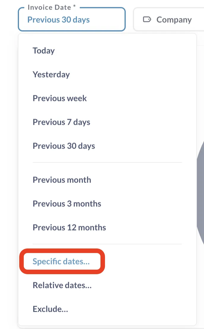
3. Apply the custom date range you would like to view the dashboard data for

What Are the Elements of the Item Validation Performance Dashboard?
The Item Validation Performance Dashboard is divided into four key sections that work together to give you a complete picture of your validation accuracy, vendor performance, and savings opportunities.
1. Summary
The Summary section gives you a high-level snapshot of your organization’s validation performance and financial impact. It highlights the most important metrics at a glance so you can quickly identify trends and outliers.


Key metrics include:
Total Validated Spend – The total vendor spend processed through Item Validation during the selected date range.
Potential Savings ($) – The total dollar value of overbilling variances detected.
Potential Savings (%) – The percentage of total validated spend that could be saved by correcting overbilling.
Line Items Matched with Variance – The number of invoice lines successfully validated against your catalog.
Match Items with Cost Variance – A drilldown on items with variance during the filtered period.
Savings Over Time – A cumulative view of realized savings based on corrections or avoided overbilling.
Top Overbilling Vendors – Vendors with the highest total overbilling.
Low Match Rate Vendors – Vendors with a high number of unmatched invoice lines, indicating incomplete or outdated catalog data.
Frequently Overbilled Items – Items or categories that show recurring overbilling patterns.
Insight: In a recent walkthrough, potential savings were measured at 5.92% of total spend — a useful benchmark for evaluating your own performance and identifying missed savings.
2. Vendor Analytics
The Vendor Analytics section lets you dive deeper into vendor-level performance. Use this area to identify your best and worst performers, monitor billing consistency, and uncover opportunities for cost recovery or improved vendor management.

Key metrics include:
Top Vendor by Spend – Shows where the majority of your purchasing dollars go.
Top Vendor by Overbilling – Highlights vendors charging above catalog prices most frequently.
Vendor Performance Table – A side-by-side view of overbilling amount, total spend, variance, match rate, and related invoices.
Vendors - Drill Down – Drill down on vendors with the highest discrepancy ratios or the most recurring overbilling issues.
Insight: Vendors with consistently low match rates often have incomplete or outdated cost data in your catalog. Updating catalog entries can quickly improve validation accuracy and strengthen future negotiations.
3. Item Analytics
The Item Analytics section reveals where pricing differences are most concentrated across your items and categories. It’s especially useful for pinpointing patterns of overbilling that might be missed in day-to-day invoice review.


Key metrics include:
Problematic Categories – Product categories with the largest pricing discrepancies.
Drilldown Tables – Click on a category to view all related line items, including invoice dates, linked invoices, and price variances.
Are Vendors Charging You Different Prices Across Stores? – Compares item costs for the same vendor across multiple stores to flag inconsistent pricing. Allows drilldown on items based on UPC.
Invoice Item Matching Outliers – These are matched items with unusually large cost variances that have been excluded from the variance total to prevent skewed results caused by potential data issues.
Tip: Use cross-store comparisons to identify when a vendor charges one location more than another for the same item. These patterns often highlight negotiation opportunities or inconsistencies in vendor pricing practices.
4. Matching Efficiency
The Matching Efficiency section helps you understand how effectively Ottimate’s AI and automation tools are working to match invoice line items to your catalog. It’s a key indicator of data quality, automation performance, and catalog health.

Key metrics include:
Category-Wise Match % – Auto-match rates by category.
Global Auto-Matched % – The overall share of line items matched without manual intervention.
Auto-Match Over Time – Tracks matching accuracy week over week or month over month.
Match Rate vs Exception Rate – Compares automated success rates to manual exceptions to spot trends.
Match by Location – Displays match accuracy for each store or region.
Top Performing Categories – Categories with the strongest auto-match performance.
Top Mapping Issue Categories – Categories where matching problems are most frequent.
Insight: A rising exception rate often signals “catalog drift” — when catalog data hasn’t been updated or new items haven’t been mapped yet. Regular catalog maintenance can help maintain high match accuracy and reduce manual corrections.
What Can I Learn from the Item Validation Performance Dashboard?
The dashboard provides valuable insight into how well your item validation process is performing and where you can take action.
You’ll be able to:
Identify vendors, categories, or items that show consistent cost increases (“cost creep”) over time.
Detect recurring overages across stores or vendors before they affect margins.
Spot spend drift caused by inconsistent pricing practices.
Compare vendor pricing across stores to ensure fair, consistent costs.
By visualizing these patterns, you can catch small inefficiencies before they grow into major cost leaks — protecting margins and improving vendor accountability.
Access & Pricing
The Item Validation Performance Dashboard is available to all users with standard (non-view-only) access by default.
If you or someone on your team doesn’t see the dashboard in Reports → Dashboard, the account likely has restricted permissions. There are no additional fees for this feature — it’s included as part of Ottimate’s Item Validation and Cost File Validation tools.
FAQ
Q1. How is Potential Savings calculated?
Potential Savings represents the total dollar amount of vendor line items where the invoice price is higher than the catalog price for the same item.
Q2. What does “Best Performing Vendor” mean?
This metric combines three factors, total spend, match rate, and discrepancy frequency, to identify vendors with the most accurate and consistent pricing.
Q3. Why does my match rate seem low?
A low match rate usually means your catalog is missing data, vendor mappings are incomplete, or new SKUs haven’t yet been synced. Review your catalog and ensure all vendor cost files are current.
Q4. How should I use this dashboard for best results?
Use a 3-month date filter to focus on actionable trends. Start with Top Overbilling Vendors to target cost recovery opportunities, and review Cross-Store Discrepancies to spot inconsistent pricing across locations. The Outlier items may indicate invalid data, or unit of measure mismatches.
Q5. Can I export the data?
Yes. Every table in the dashboard can be exported as a CSV file for additional analysis or reporting outside Ottimate.
Additional Support
If you need help accessing the dashboard, adjusting permissions, or interpreting your data, contact Ottimate Support at support@ottimate.com.
Was this article helpful?
That’s Great!
Thank you for your feedback
Sorry! We couldn't be helpful
Thank you for your feedback
Feedback sent
We appreciate your effort and will try to fix the article